Sunday 30 November 2014

Older Review : Black Narcissus.

Fig

Black Narcissus
A film by Michael Powell presents us with a different view of a nunnery, a group of nuns travel to the Himalayas and set up a convent atop a windy mountain range, in the Palace of Mopu, near Darjeeling, to set up a school and hospital for the local people. This Palace was used to house the servants and female prostitutes, and there are subliminal images on the wall that suggest that this ‘’fun’’ house was very ‘’practical’’.  This was part of the strong influences of tension and the temptations surrounding the site, the weakened sprinted Nuns seemed to fall prey to these images and their perverted vibe. Lathier describes, "Michael Powell was right when he called Black Narcissus an "erotic film," but the attraction is pure Pygmalionism"(Lathier, 2012).
It’s not just the sexual diversions that make up this film. Bagatavicius, in Off-Screen describes it as follows. ‘’Although Black Narcissus can be seen as a hybrid of genres – from colonial or religious satire to melodramatic art film and noir thriller – for the sake of this analysis, it might best be construed as a ‘dark fairy tale’; as borrowing the fantastical, oneiric qualities of a remote enchanted world.’’ (Bagatavicius, 2012.) This can be seen throughout the movie – or rather as the movie progresses, the colour scheme and the characters change as the movie goes on. With the main focus on Sister Ruth who has been hit with this temptation the hardest. With the scene that she removes her nun outfit and dresses in a dress and puts on the lipstick, the movies vibe takes a dramatic leap into the thriller zone with the amount of red being exposed and the creepy facial expressions she pulls throughout the film, see figure 2 and 3.
Fig 2 - Start of the seduction. 

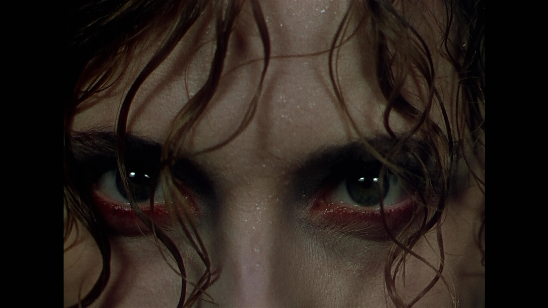
Fig 3 - Sister Ruth after being rejected.


The colour red is a symbol for sexual desire in this film. It starts with the scene that sister Ruth comes bursting into the room covered in blood. Bagatavicius describes it well, ‘’From then on, she Ruth is more woman than nun. Her white habit, splashed with blood, indicates the sexing of the character. In the same image, menstrual blood and the symbolical loss of virginity are displayed, as they will be again later in the red dress that will replace the uniform and advertise her difference from the rest.’’(Bagatavicius, 2012.) As this movie was released in an era where displaying the sexual act, and women dominance was not prohibited, this was the closest film-makers can get to displaying the sexual desires of a woman. In a dark way of course, Ruth is the symbol of this rebel act. Bagatavicius continues to explain, ‘’As implied by ThiĆ©ry, these two moments – her barging into the room, and her revelatory changing of outfits – are bookends to her ‘monstrous’ transformation from tainted, fraudulent nun to carnal, frenzied woman.’’(Bagatavicius, 2012.)
With strong, powerful camera angles, stills, and matte paintings. Black Narcissus, displays some really empathic camera usages, as Lanthier describes; ‘’Powell icily builds tension with unmerciful scenarios, but his camerawork is some of the most empathic in cinema; his perspective-oriented angles and fluid, slight dollies evince a loyal concern for what and how his characters are thinking and feeling.’’ (Lanthier,2012). One very powerful scene is when the sister is standing at the edge on the cliff looking over the edge, here she sees how high up in the heavens they are, closer to god but not further from temptation. (See Figure 4)
Fig 4. Camera Angle and Matte Painting
 This reflects back to the idea of being a fantastical movie – it would be the idea of a Castle in the Clouds, the perfect setting for a woman to live and dream of – or desire.
In conclusion, past the suggested horror/thriller, fantasy and dark nature of this film, it’s basically a description of both a woman’s hidden struggles when it comes to dealing with temptation, sexual desire, isolation and the male embodiment.


Illustration List:
Fig 1. Film Poster. (1947)  http://content9.flixster.com/movie/34/10/47/3410471_det.jpg
Fig 2. Ruth becoming corrupted (1947) http://www.nisimazine.eu/local/cache-vignettes/L600xH439/EX_BLACK_NARCISSUS_1web-7f898.jpg
Fig 3. Sister Ruth after being rejected. (1947) http://offscreen.com/images/Narcissus_Ruth_CUEyes_hires.jpg
Fig. 4. Camera Angle and MAtte Painting (1947) http://zendavis.com/wp-content/uploads/2012/12/black-narcissus.jpg

Bibliography
Adam Bagatavicius, http://offscreen.com/view/holiness_in_black_narcissus, Off-Screen, 2012. (Accessed on 30/11/2014)

Joseph Jon Lanthier,http://www.slantmagazine.com/film/review/black-narcissus, Slant Magazine, 2012)

Sunday 23 November 2014

@Phil - Orthographic re-visted part 1

So I have been busy the past two days so I haven't had the proper chance to do them, but I have re-drawn the orthographic of the lamp post. Is this what you meant Phil? Any better?

Wednesday 19 November 2014

Life Drawing.

SO I took these with my phone, the concept is that we did 5 min, 1 min and 30 second studies. At the end we did a longer study where we could focus on one area, like the hands; feet, head and anywhere else really. We could use any medium and our sketchbook.


@Phil and @Jordan! Help! Thumbnail's 104-112, Final Comps.

So I edited the image, lowered the mountain so that the building grew up above it and I tried to use both an example of Erte's work for the colour pallet and Art Deco (for example from the Crystal Building) to change the top of the spire. Also I can't see if the colours are the same - being shade colour blind does have a bad effect when you've been staring at bright colours all night. I want to use this as my final idea as I really do love the composition and angle. Also it seems my creative partner's also like the arrangement. I just don't know which ones to use as the colour comp. And I request help on the painting as the lasso tool isn't really being friendly with me right now. I also don't understand what you meant Phil, about how it doesn't encompass Erte's sharp crisp forms? Are you referring to the fact that the lines are scratchy and sketchy? Or not straight and generic? I'm rather confused in that matter.


Monday 17 November 2014

@Phil, @Jordan, concept art idea.

So after my quick feed back I extended my original drawing and - poorly - coloured it. Using some of Erte's work as a color template. Probably not what you was talking about Jordan, but my tablet is having comparability issues at home - I will be continuing this experimentation tomorrow long side working on my othrographs.


Thumbnail 100 - Concept 16:9 for OGR idea.

So in the photoshop tutorial lesson, I spent a long time, maybe too long, on this thumbnail because I really liked how it was going and how the angle ended up. I used this method I found for an easy perspective grid using a octagon shape and then just started drawing.


UV Mapping - In Progress

With a 3 hour catch up lesson I still have not managed to catch up completely, but I have been working on the UV mapping of the set! Progress!! Too many colours, it hurts my eyes. So I guess a break would be good.


Sunday 16 November 2014

94 - 99 Thumbnails

So I decided, after having a quick conversation with Phil yesterday I thought about creating a little more on the 3D modelling scale. And I am planning on making a colour comp with these. But I was evidently experimenting with angles to see which looks right. - The way the model turned out is actually an accident when I scaled the blocks.


Friday 14 November 2014

3d Model, thumbnail idea.

So I spent most part of my evening attempting to build one of my thumbnails in Maya to test what it may look like, I need to colour it in photoshop but I do not know how to 3D map/colour yet. But this alone took me 2 hours, sort of panicking now as I don't know what definitive idea to go for? I seem to be leaning towards this Art Deco themed frontal building, with the housing buildings aligning it and setting themselves back. With the mountains behind it..


MAJOR Problems with this. Pencil Character Texturing.

I had major major issues with my maya as it crashed several times and it will not properly texture the pencil. The rubber turned out well anyhow. Other then still not being able to bend it.

Texturing and shaders complete:


Thursday 13 November 2014

92 and 93 - Need some advice and a solid Idea design...

There seems to be a constant arrangement I seem to be venturing back to when I try and design my city. In all honesty, I have no idea what and how to progress from here considering I need a full concept art done by Wednesday.  I need people's opinions (looking at my other thumbs) and ones that I aim to post by Sunday.

Zetrope Ideas

For Animation with Meg I have decided to stick with a festive theme and have a Reindeer prance/run across the zeotrope (preferable with some theme music.) I need to REALLY work the anatomy.


Thumbnails 77-91

So I have been working on some sketches in response to the Photoshop tutorial session with Jordan, I know the quality is not very good - I scanned the images from my sketchbooks. Thumbnails 85-91 are brush preset ideas I could use to create textures/patterns/brushes for the concept art based on design patterns within Erte's work. I really like number 77, as this was and honestly is the only one there that makes actual sense - in terms of art deco.


Maya Tutorial Set Complete

So I have finally completed everything, in terms of the modelling, for the Set design. I can now move onto texturing both the set and the characters.


Wednesday 12 November 2014

Edward Scissor Hands Movie Review.

Fig. 1 Film Poster.


From the most renowned director of the ages, Tim Burton brings us this iconic example of how a little act of kindness can go a long way. There are always ways to show kindness. But Peg, the main protagonist, a woman who’s main job is representing the make-up company Avon and going from door to door helping the neighbor with their appearances. Upon unsuccessfully marketing more sales, she decides to venture up to the dark and gloomy mansion on top of a hill that does not seem to fit the brightly coloured set. (See figure 2). 
Fig. 2 Street with pasty coloured houses and cars. 

The mansion is owned by an inventor who built Edward. The strange yet misunderstood creature of a man that upon being approached by Peg says nothing, and as Gielberman analyses. “He almost never says anything, and when he does, the voice that comes out is shockingly soft and delicate, full of a child's serene wonder.” (Gielberman, 1990). The sweet, innocent eyes of this monstrous design, really brings out Tim Burton’s motives. The idea that the beast can ‘’capture’’ the beauty, allow herself to be charmed by his strangeness, his oddity. However, upon being admitted into the neighbor scene, Edward his derived as a strange, but simple creature who gives very good haircuts for beast (the dogs) and themselves, as wells as an artist at garden structures.
When Peg brings Edward home he acts just as he would with the persona of a child, innocent and full of wonder, being curious about everything he almost breaks everything that he touches. When he is discovered by the ‘’chickens’’, or the women that live in the neighborhood, he is used as a tool and exploited due to his scissor hands. He gets treated like a child and he seems alright with that. It seems that Tim Burton has been balancing out proportions in terms of this film is the nature of acceptance that is so perfectly balanced at times it shows Tim Burton’s sensitive use of secondary commentary to infer something other than “do not judge a book by it’s cover”. As Peter Travers describes, ‘’Burton's richly entertaining update of the Frankenstein story is the year's most comic, romantic and haunting film fantasy. ‘’ (Travers, 2001) It seems that the theme of the film is three colours, but so can everyone else. In that sense no one is being original and the atmosphere becomes repeated and bland. As it was in the year the film was set [1950-60’s]. 
In all honesty, Edward Scissor hands is a Frankenstein meets Beauty and the Beast. With the introduction of Peg’s oldest daughter Kim, brings new light to strange tale. Edward doesn’t understand the feelings that he is experiencing with Kim as he has only ever experienced it with is creator/father. She falls in love with him regardless of his appearance and even after the incident with her ex. As Chris Cabin describes, His Gothic tones always mask a feeling of wonder and an endearing love for everything that is possible in life and death,’’ (Cabin, 2005). (See figure 3).


To summarize, this film has been a very strange experience, but a wondrous film to watch. It has that same charm as a Christmas film as well as a horror and the classic romance.

 Illustration List: 
Figure 1: Burton, T. (1990). Film Poster. http://pastormattblog.com/wp-content/uploads/2013/10/edward-scissorhands-original.jpg [Accessed on 12th Nov. 2014] 
Figure 2. Burton, T. (1990).
Figure 3. Burton, T. (1990). Kim and Edward. http://images4.fanpop.com/image/photos/22300000/Edward-Kim-edward-scissorhands-22305845-500-250.gif [Accessed on 12th Nov. 2014]


Bibliography:
Gleiberman, O. (1990). Movie Review: Edward Scissorhands | EW.com. [online] EW.com. Available at: http://www.ew.com/ew/article/0,,20609141_318762,00.html [Accessed 12 Nov. 2014].
Travers, P. 2001, Rotten Tomatoes. http://www.rottentomatoes.com/m/edward_scissorhands/ [Accessed 12 Nov. 2014]
Chris Cabin, 2005, Rotten Tomatoes http://www.rottentomatoes.com/m/edward_scissorhands/ [Accessed 12 Nov, 2014]


Monday 10 November 2014

Thumb nailing Help from Jordan. Sort of Getting it.

So I seemed to have been lost in a spiral downwards in progress and after photoshop tutorial today I think I get the gist. I made number 76 in response to the other thumbnails. I wish to use the other thumbnails but as I didn't make them I can only refer to them.

Maya Tutorial - Set_Design Progress. - Lamp Post.

In today Maya tutorial I focused on the lamp post. I had a Maya-crashing related problem and had to make the entire thing again.