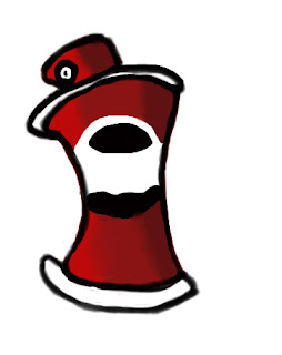
So after some feed back from some peers I started today on looking at my icon of a spray can. I made it so that it has qualities of a comic book, suck as the thick outline and bold colours. I added the background and shading on the second one to see how it would contrast with a background.


I think it works. Initially I was curious at the blur between the shading grades as this might detract from the comic effect a little.
ReplyDeleteThe outline could do with a little cleaning up though, I can see a grey edge around the base of the can that is jarringly prominent in the shadow.